Authenticity is Everything
Jim Morrison autograph
I have a Morrison autograph. Bought it 10 years ago. Anybody have any opinions about the authenticity of it?
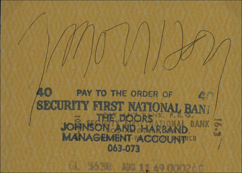
I have compared it to known signatures on Doors stationary, checks, and Christies auctioned signatures and it matches up all the way down to the age of paper and ink. The paper looks 40 years old. Ball point pen. Would love to have someone authenticate it or give me a value of it. Thanks.
- Attachments: No photo uploads here
-
-
 5e_3.JPG, 25 KB
-
Replies to This Discussion
-
Permalink Reply by Steve Cyrkin, Admin on
-
@Ballroom:
Thanks! I forget to look at AAT anymore, since Roger hasn't published anything there in a long time.
One of those checks is the same one Thinkfish is used above and both came from RRAuction and are in my post of Morrison checks on Friday.
-
-
Gordon--Ballroom uploaded the URL for the three sigs, so never mind. Thanks.
-
Permalink Reply by Gordon O'Steen on
-
Hi Steve.
Yeah, I forgot to mention that it was AAT. Glad ballroom helped.
-
-
That is the other thing that struck me. It is a ballpoint pen that flows consistently with no stops and starts inside the lettering (such as the "orr" for example). Once again, I am know expert but this sig looks darn good to me.
Now, if this was sitting in front of me and I could really see the entire piece, I may or may not change my mind. I am of the opinion that you need to see the physical piece to make an honest opinion. I don't care how good the photo is or is not. The ink needs to be seen up close with the naked eye and not through a computer screen, especially when signed in ballpoint pen.
So I am still posing the question to experts and collectors alike. How can a supposed forgery be this good? I am all ears.
-
Permalink Reply by Thingfish on
-
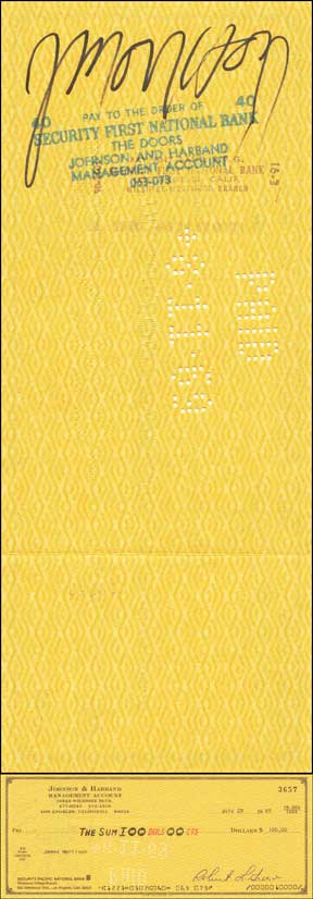
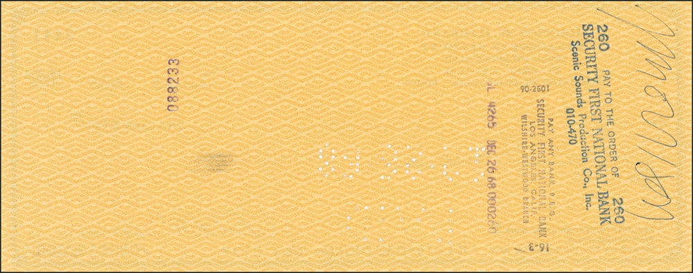
Here's some better close ups of the signature in question. Thanks.
One in different filter
The whole sheet
Thanks for looking at it everybody. I really appreciate the feedback!
-
-
@Gordon—you said:
"I am of the opinion that you need to see the physical piece to make an honest opinion. I don't care how good the photo is or is not. The ink needs to be seen up close with the naked eye and not through a computer screen, especially when signed in ballpoint pen."
If an autograph looks clearly wrong in a photo (doesn't have the characteristics of the subject's handwriting, etc.), how is seeing it in person going to change your opinion? But I agree that you should see a piece in person to confirm that it's genuine.
As for your question asking how a supposed forgery can look so good? There are some very talented people out there who practice and practice.
-
-
Yeah, I didn't articulate my statement that well. I meant it in the context of verifying the age of the signature, especially with ball point pen. A photo is 2-D and does not show pen pressure....well I can't see it. You and others on this site are much more versed than I at picking out those traits.
-
-
That makes sense. Some people seem to be able to see pen pressure effects in photos, but it has to be obvious for me to be able to.
I'm actually better at picking out traits of forgeries than picking them out on genuine items, but I'm learning a lot from our members and discussions.
One thing that helps is that most forgers only learn one basic style of forgery, although they often get better and better at it over time. So you can learn to recognize many of the fakes that way.
-
-
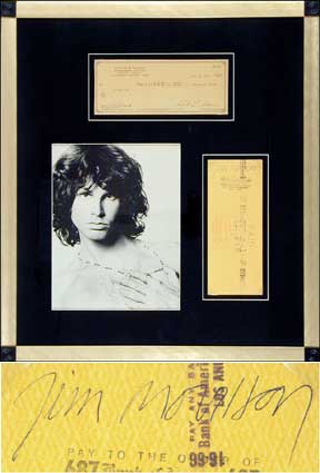
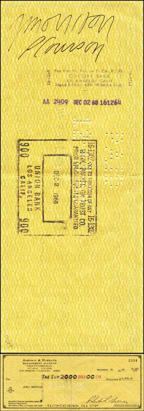
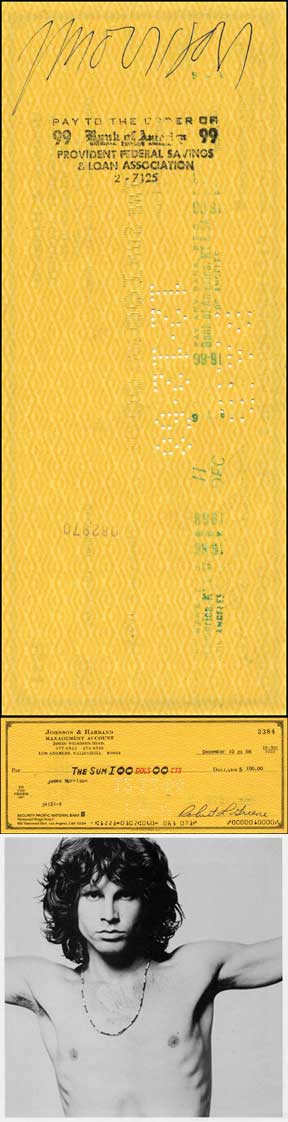
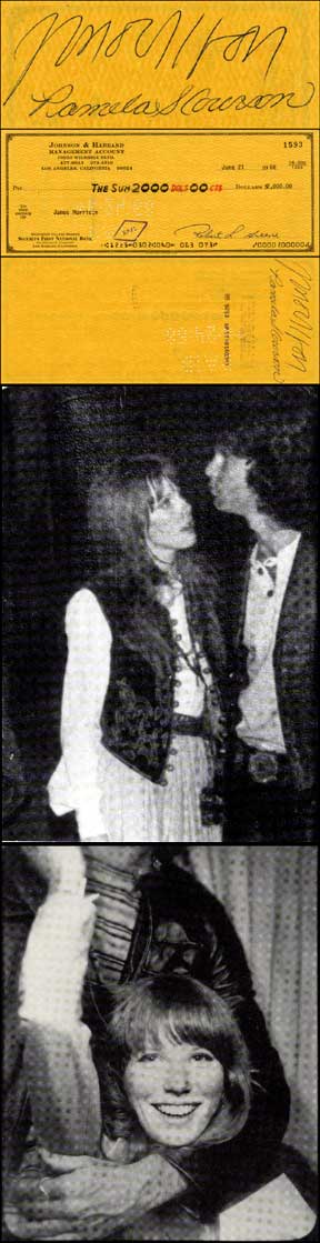
These are all the Jim Morrison endorsed checks from RRAuction.com. One major thing to note is that the "s" on yours has a top curve, but the other examples you uploaded and these don't.Some of these may be duplicates they sold more than once. I didn't check:


-
-
Good stuff Steve. Lots of examples to compare and yes, the "s" has a top curve.
Is this something to consider when attempting to authenticate an autograph? Absolutely. Is it all that important pertaining to this example? I don't think so. If all of the letters appeared to be completely off the mark, then yes, this aspect would probably weigh more. But we all have different quirks in our signatures and in my opinion this aspect is on many occasions entirely overblown. I have sat down and written my name 10 times and then analyzed the signatures. There is always an extra curve, hook, height or length difference in some of the letters, but the overall appearance and essence of the signature is present. In this instance, the "s" has a top curve but it's not like the letter sticks out like a sore thumb.
-
-
@Gordon:
That's why it's critical to get the opinion of people who have really studied a subject's writing. They look at the piece overall and not just the telltale signs. They have a feel for the subject's handwriting.
As an eBay Partner Network Affiliate, we earn from qualifying purchases.
Get Our Newsletter
Photos
© 2026 Created by Steve Cyrkin, Admin.
Powered by
![]()
Badges | Report an Issue | Privacy Policy | Terms of Service